Brand Identity Design
Brand Guidelines
Website
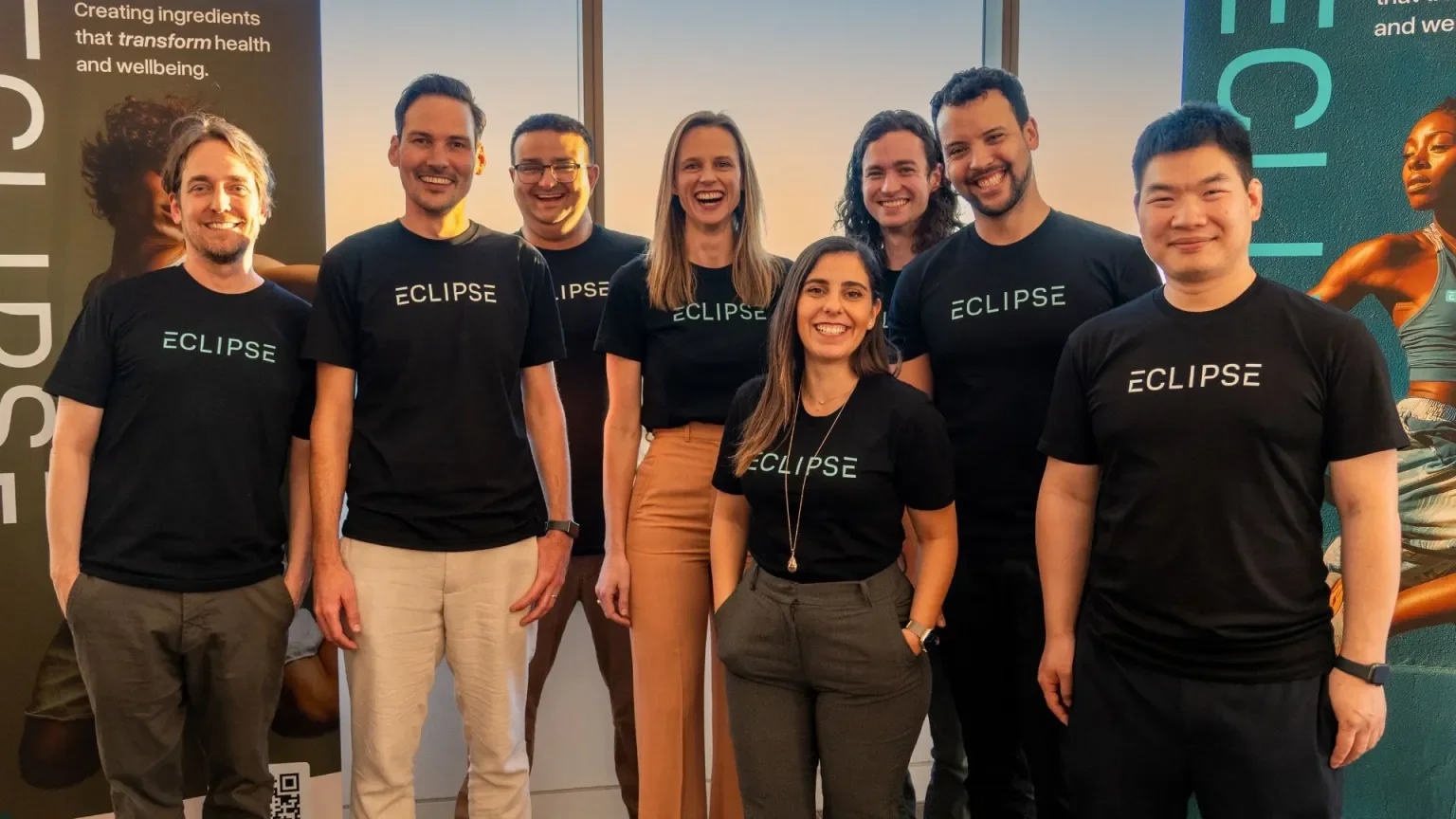
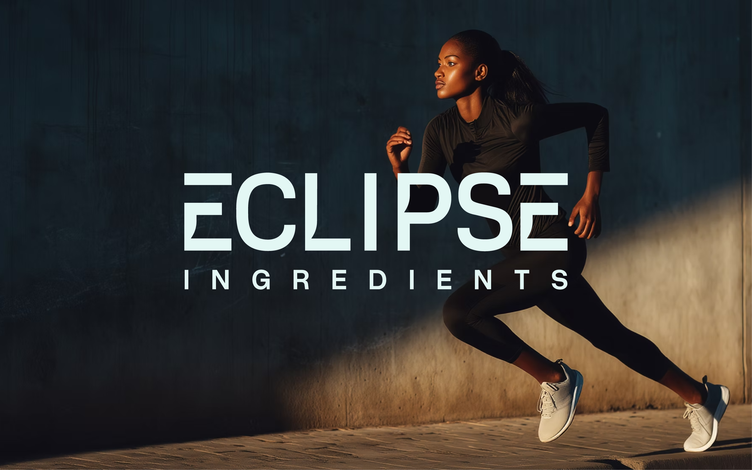
Eclipse Ingredients is a biotech company using precision fermentation to sustainably create premium ingredients that enhance wellbeing at every life stage and transforming what's scarce into what's accessible.


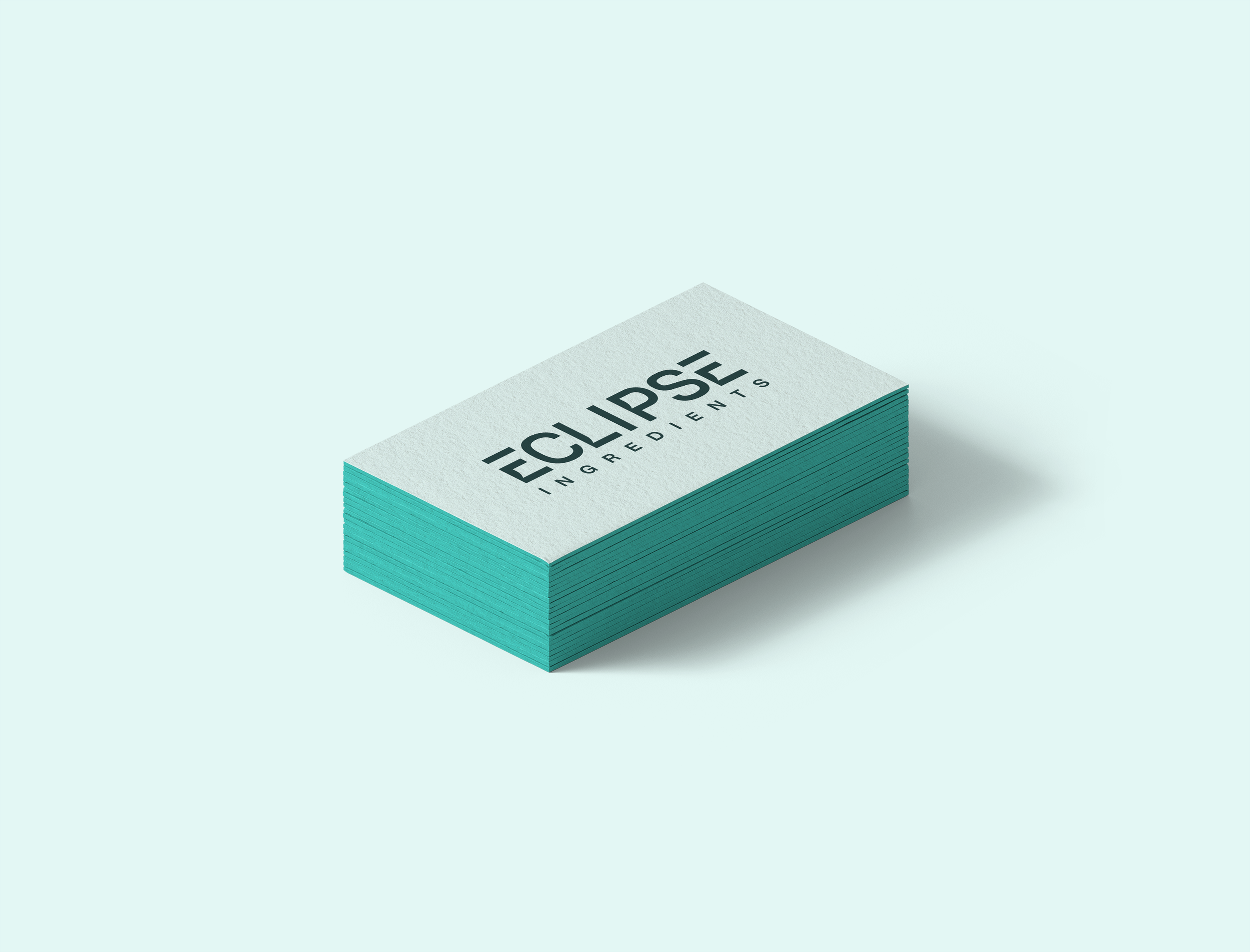
The identity reflects Eclipse’s innovative, science-led ethos while remaining approachable and premium. It features a custom logotype, an abstract “E” logomark, a fresh teal-led palette, and clean typography using Overused Grotesk. The result is a modern, premium brand that balances scientific precision with human impact.

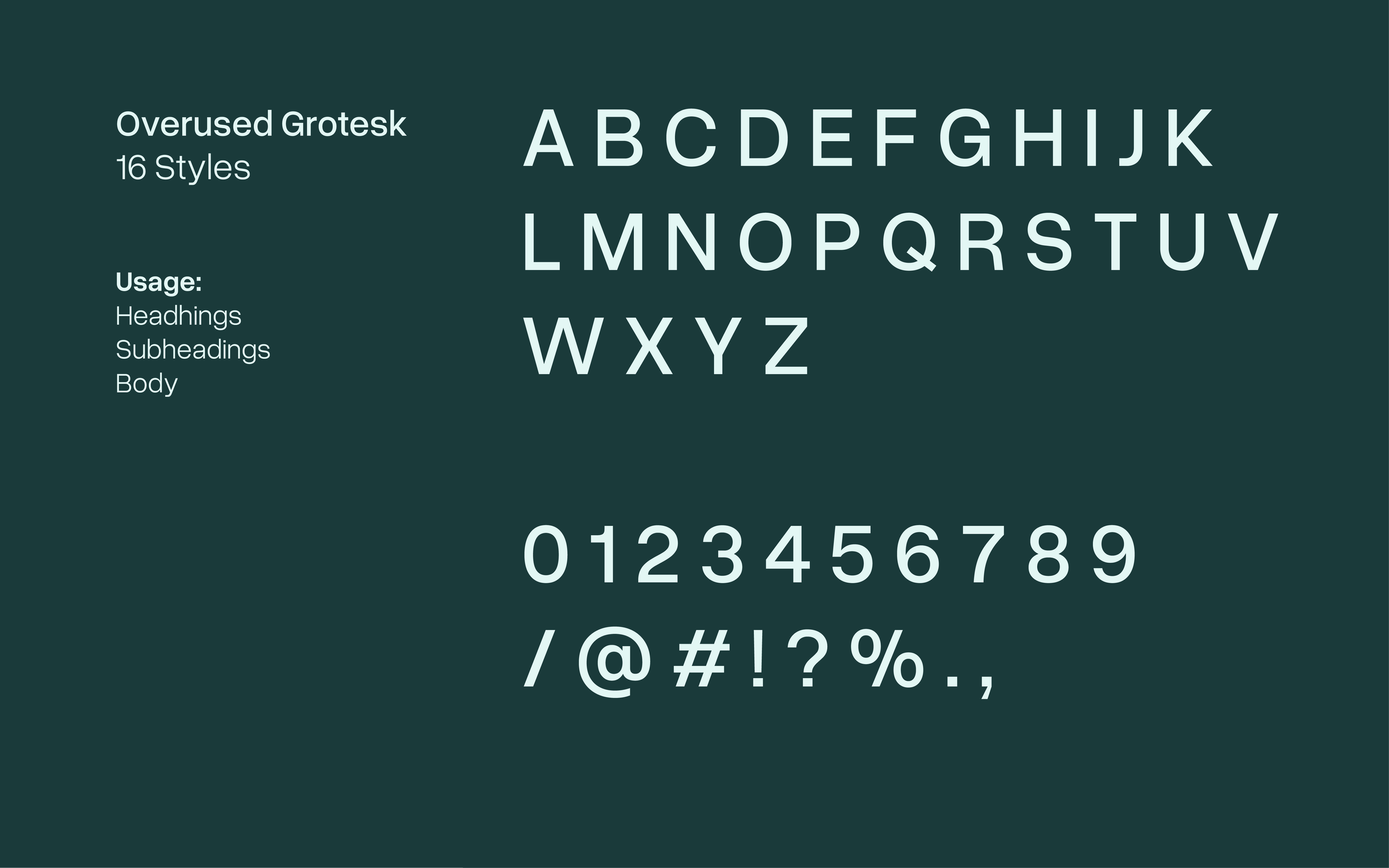
TyPOGRaphy
Overused Grotesk is the primary typeface embodying the company's forward-thinking and science-driven ethos. Its clean lines and refined structure provide a contemporary appeal. With 16 styles available, this typeface ensures clarity and balance.
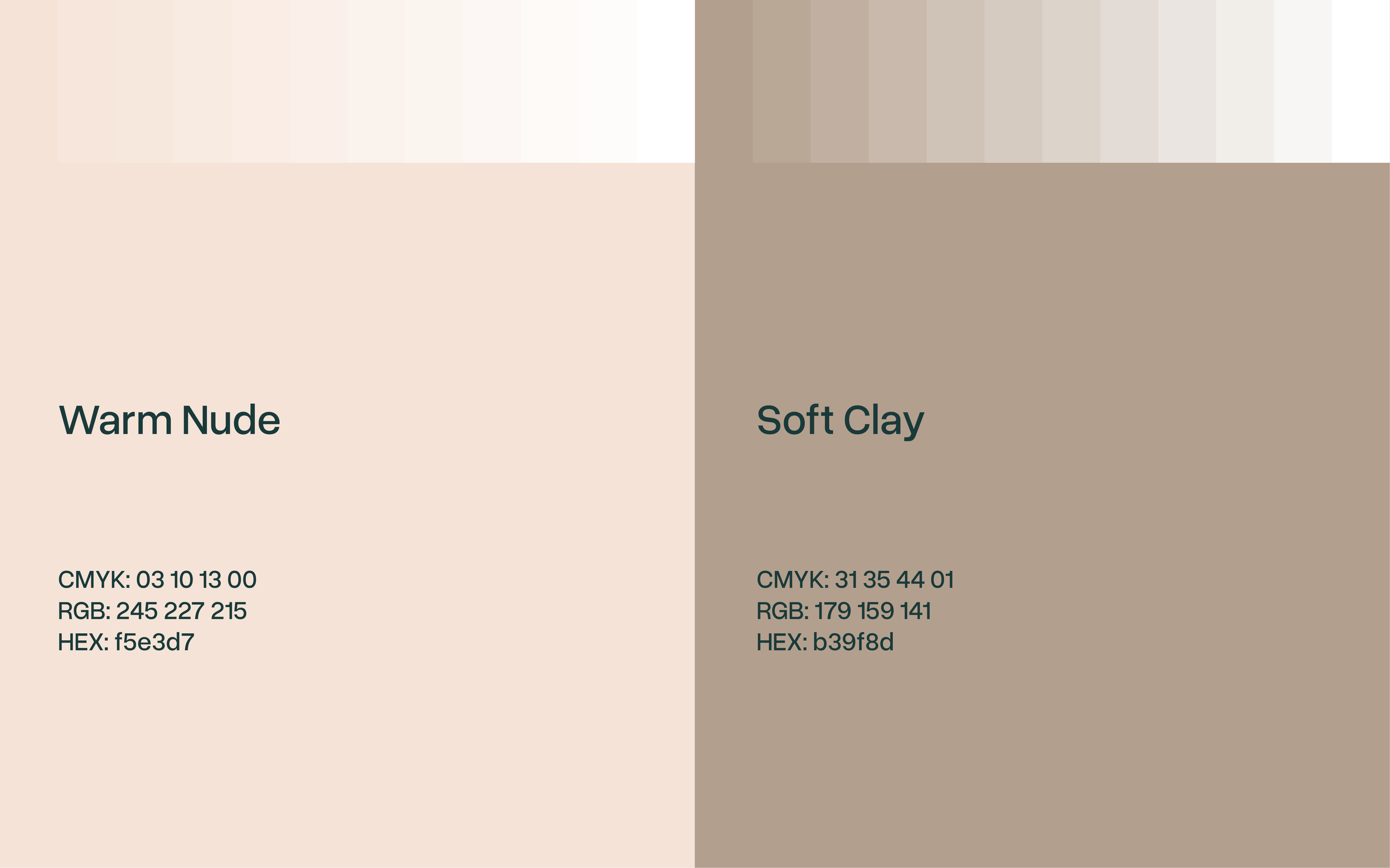
Colour Palette
The Eclipse Ingredients colour palette is designed to reflect the brand’s innovation, trust, and scientific precision while maintaining a premium and health-focused aesthetic.

Supporting Colours