THE
KODAIKANAL
LIMITED
Brand Identity
Kodaikanal, Tamil Nadu
Building a year-round transport and experiences business in the Palani Hills of Tamil Nadu.
The Challenge
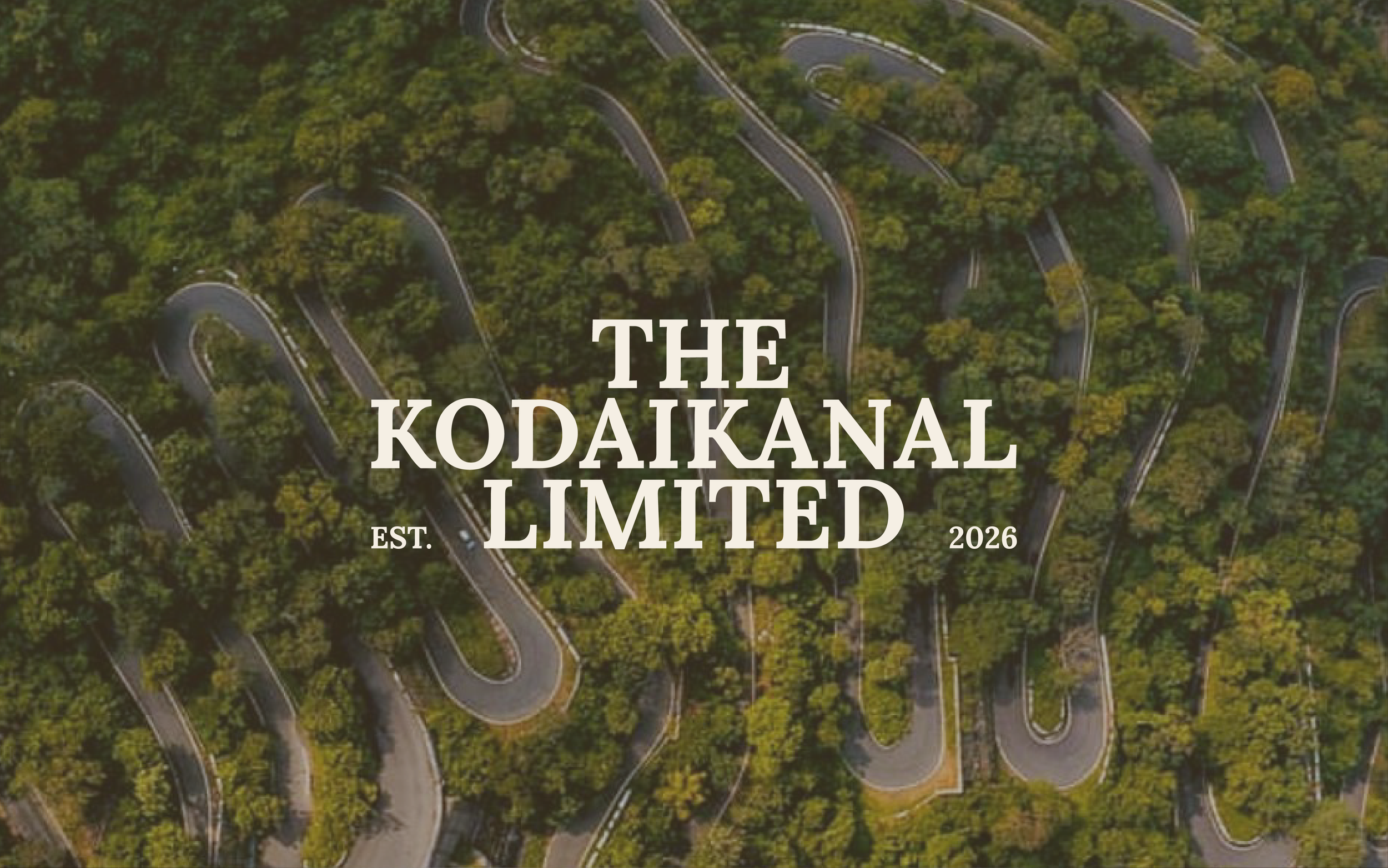
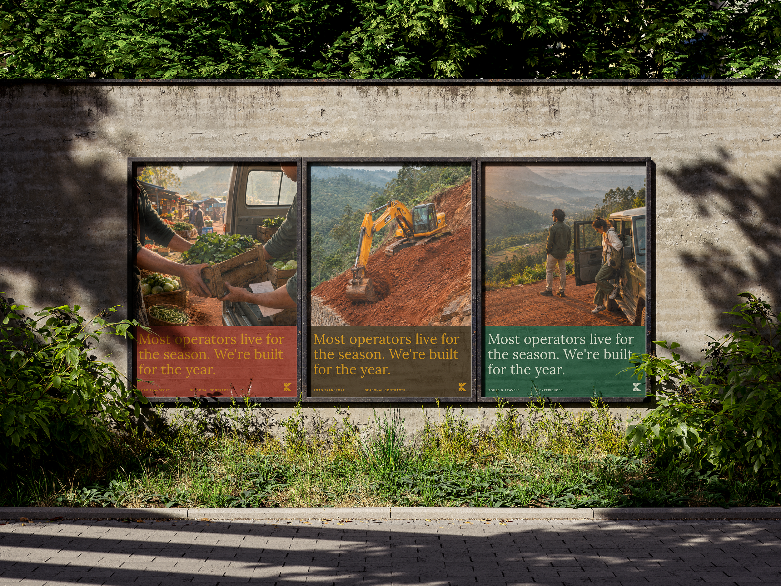
Kodaikanal's transport market runs on informality. Operators appear in peak season and disappear in November. Pricing is opaque. Accountability is rare. The founder, who lives in Kodaikanal and built this business to stay, needed a brand that could hold four distinct services under one mark, serve both residents and international visitors, and signal year-round reliability in a market defined by seasonal absence.
POSITIONING
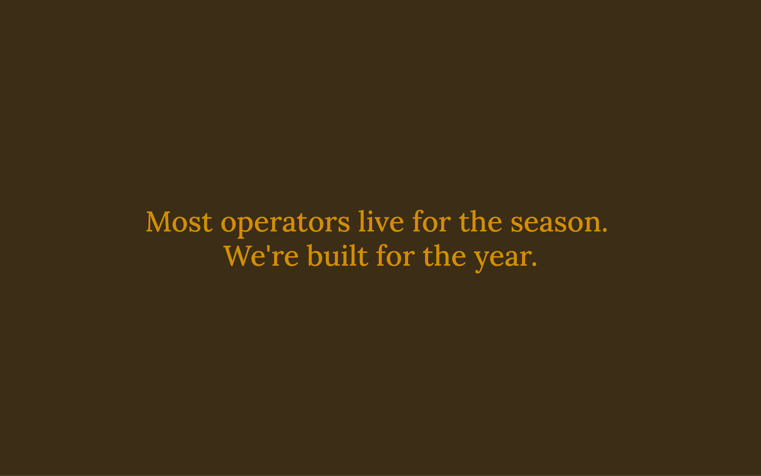
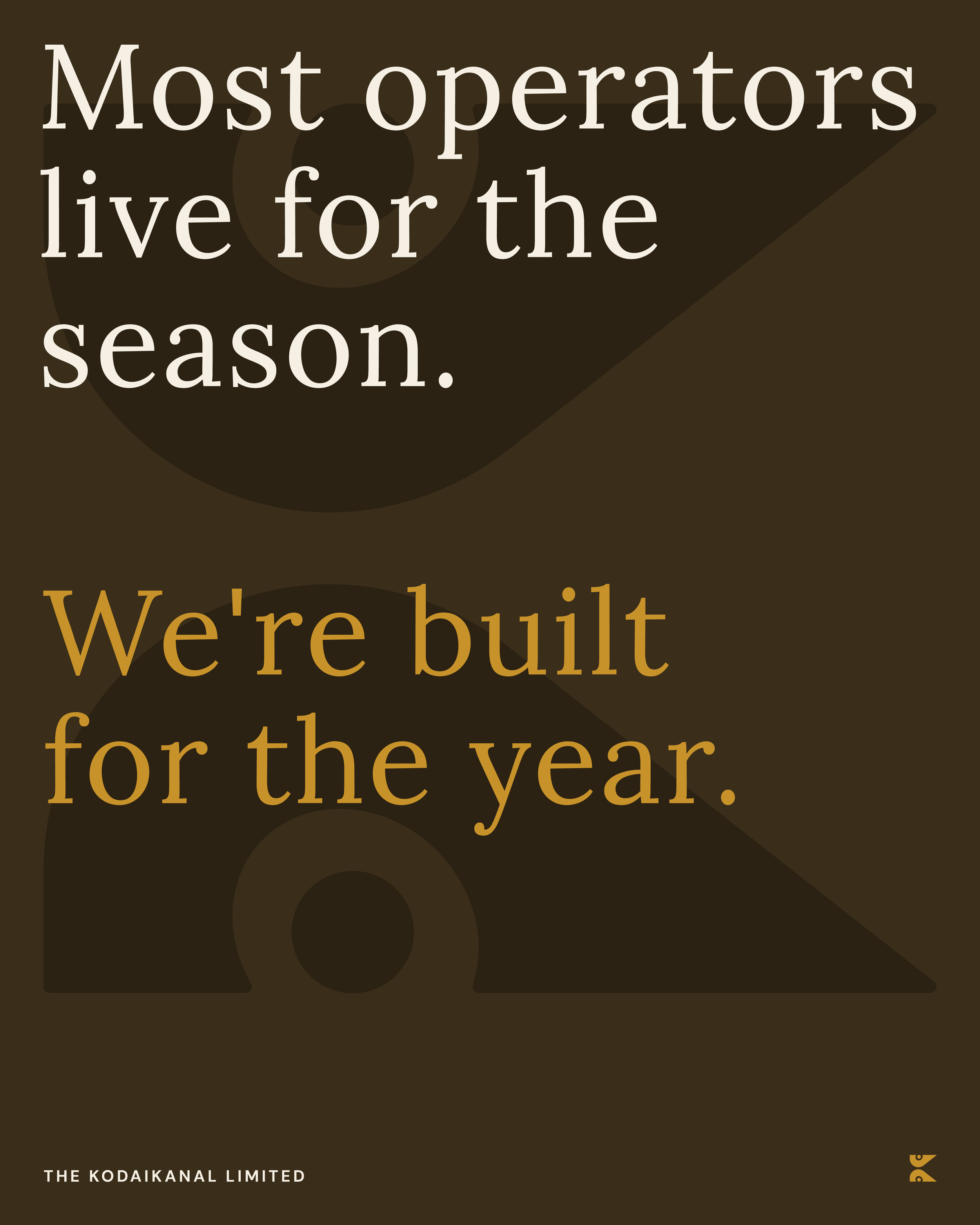
The key insight came from the founder's stated value of sustainability. It did not mean environmental sustainability. It meant economic sustainability: a business designed not to collapse when the tourists leave.

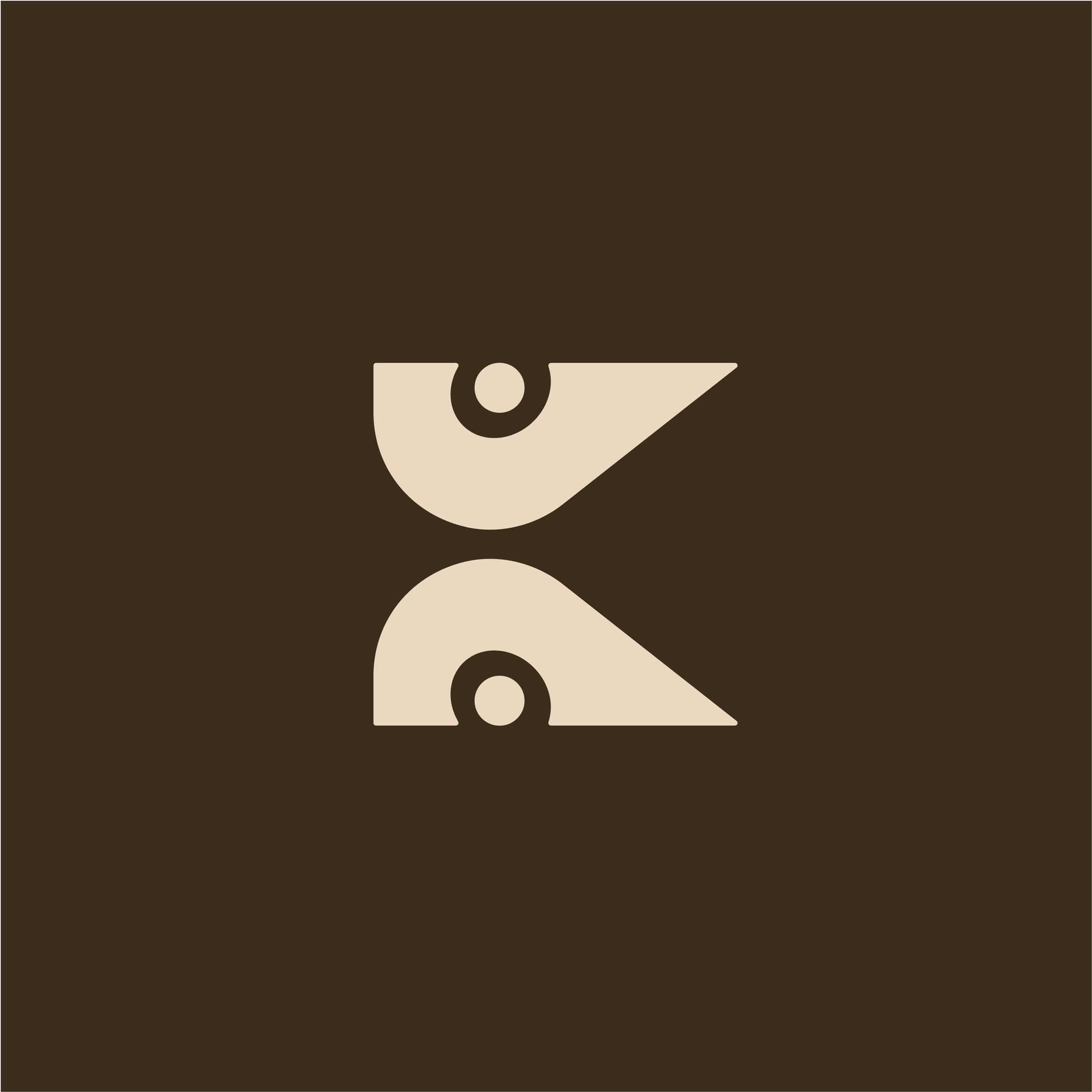
Brandmark
A letter built from
the landscape.
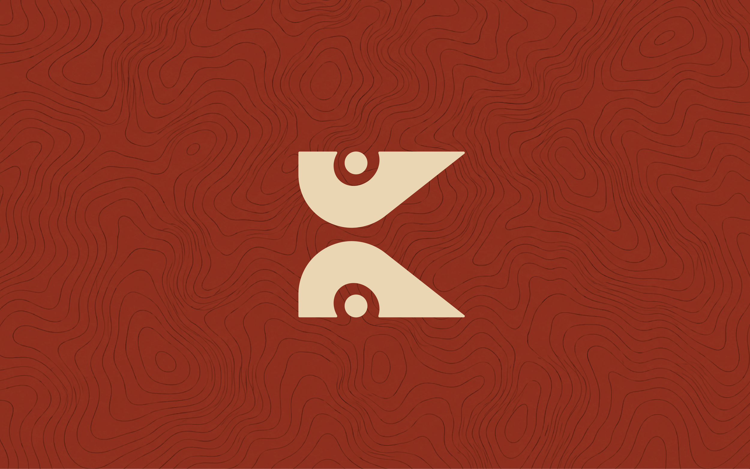
Kodaikanal is the only thing that appropriately ties all four services together. The hills, the terrain, the roads that wind through it, the landscape that makes every service both necessary and specific.
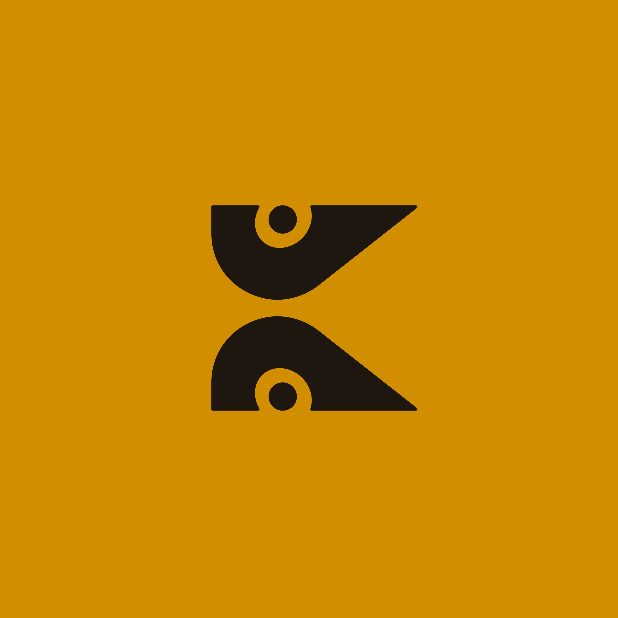
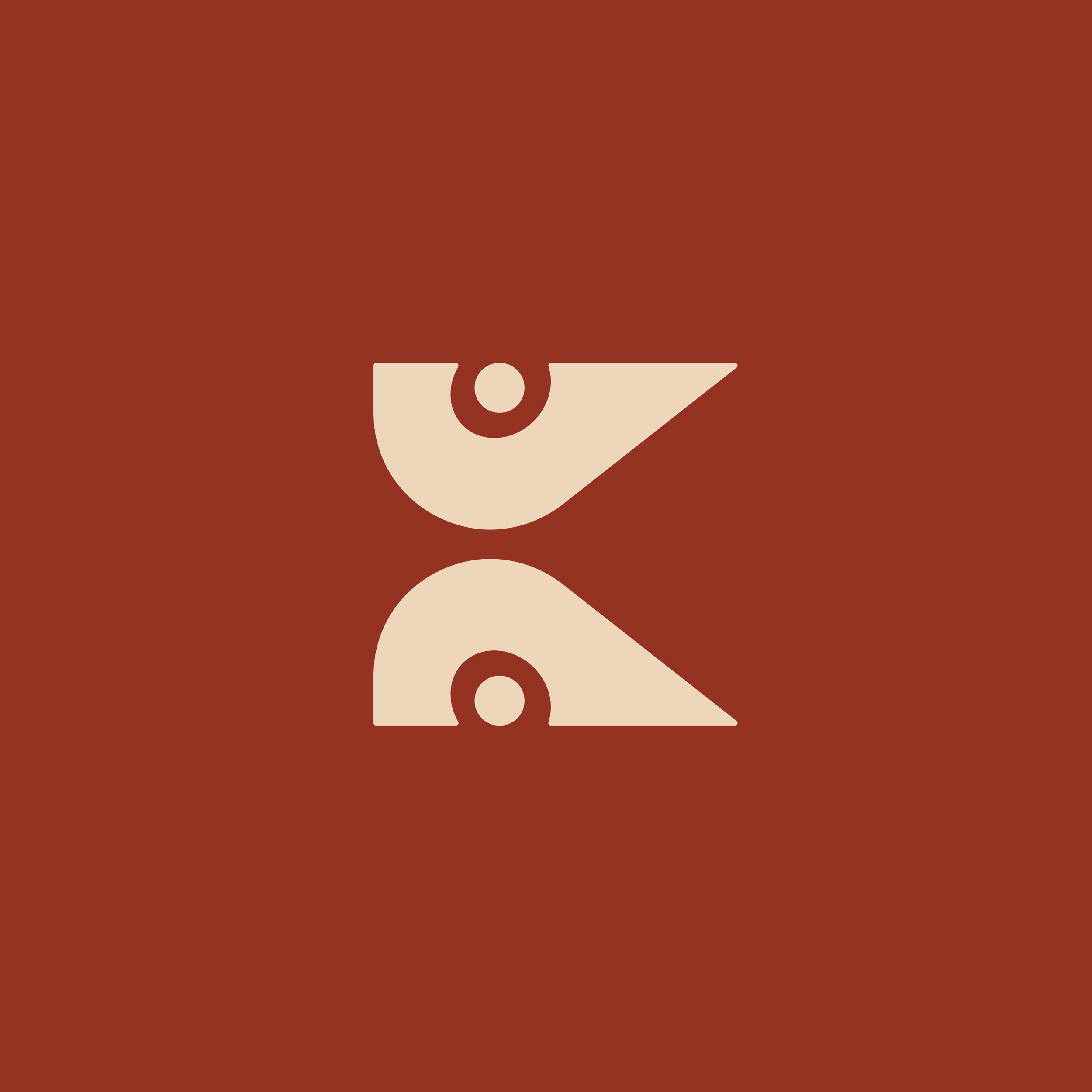
The mark is a geometric abstraction of the letter K: two mirrored forms, each built from a triangle, an arc, and a circular eye. It reads simultaneously as the company's initial, a road curving through hill terrain, and contour lines on a survey map. A mark that works in this landscape, with it, and for it.
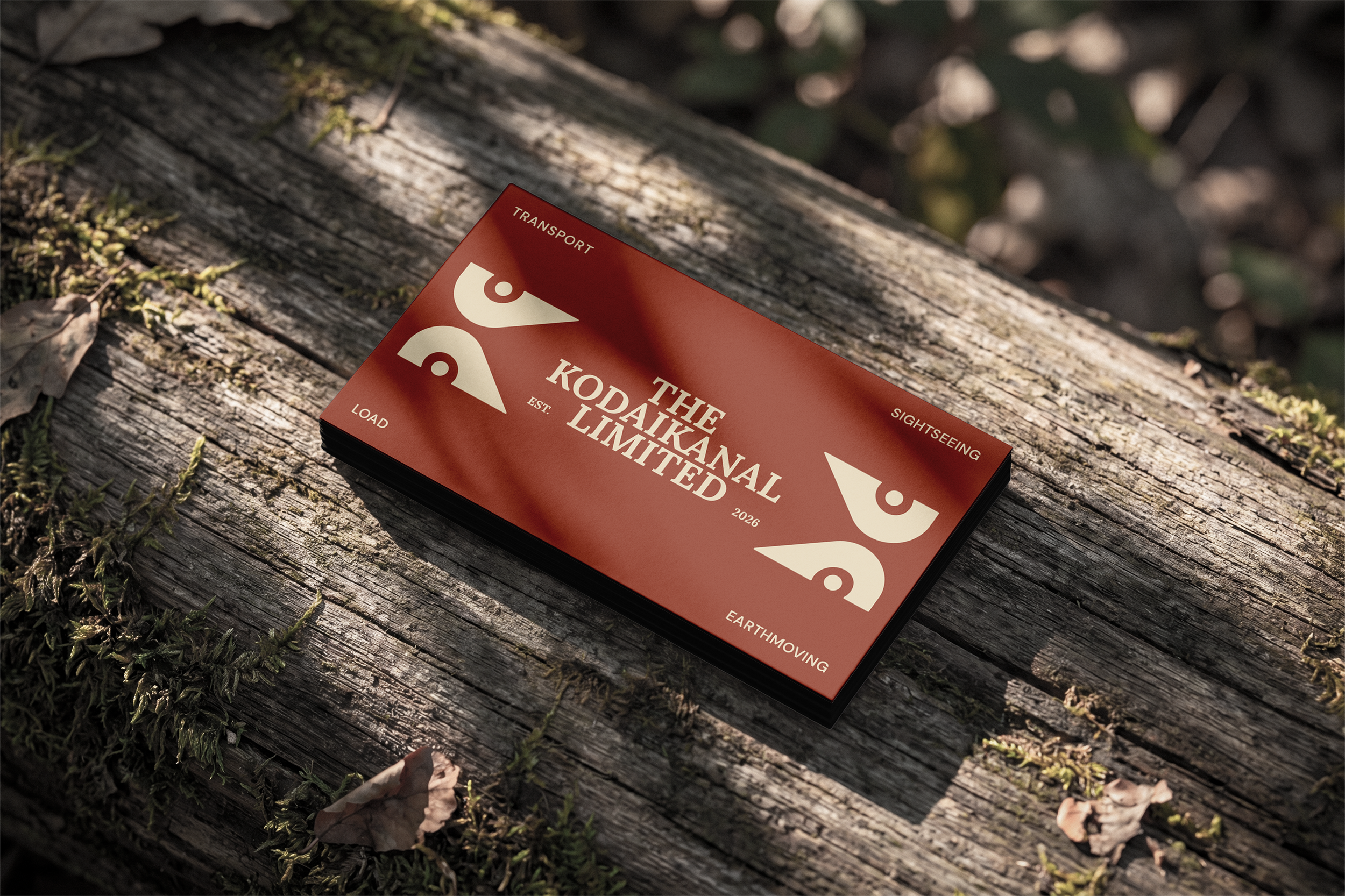
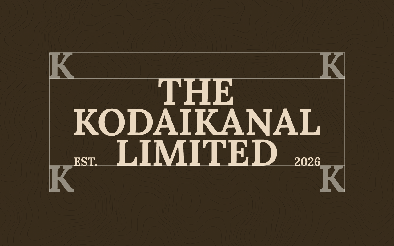
Wordmark
The wordmark uses Lora, a humanist serif with editorial authority and warmth. Set in bold uppercase with generous tracking, it reads at distance on vehicle livery and at close range on a business card.
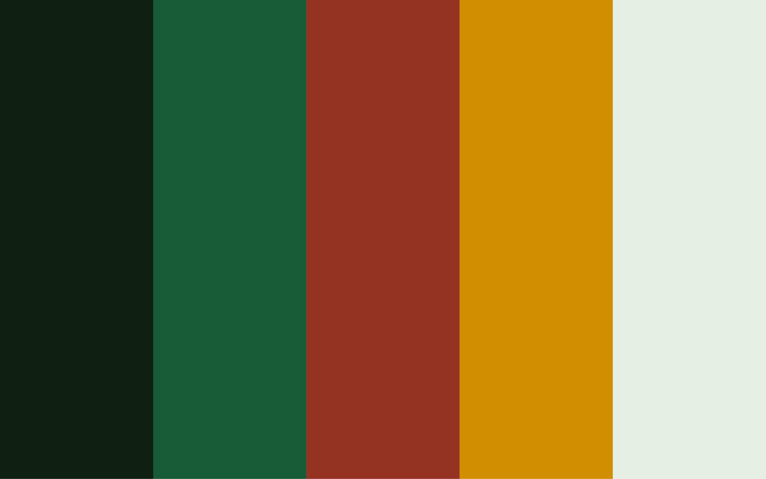
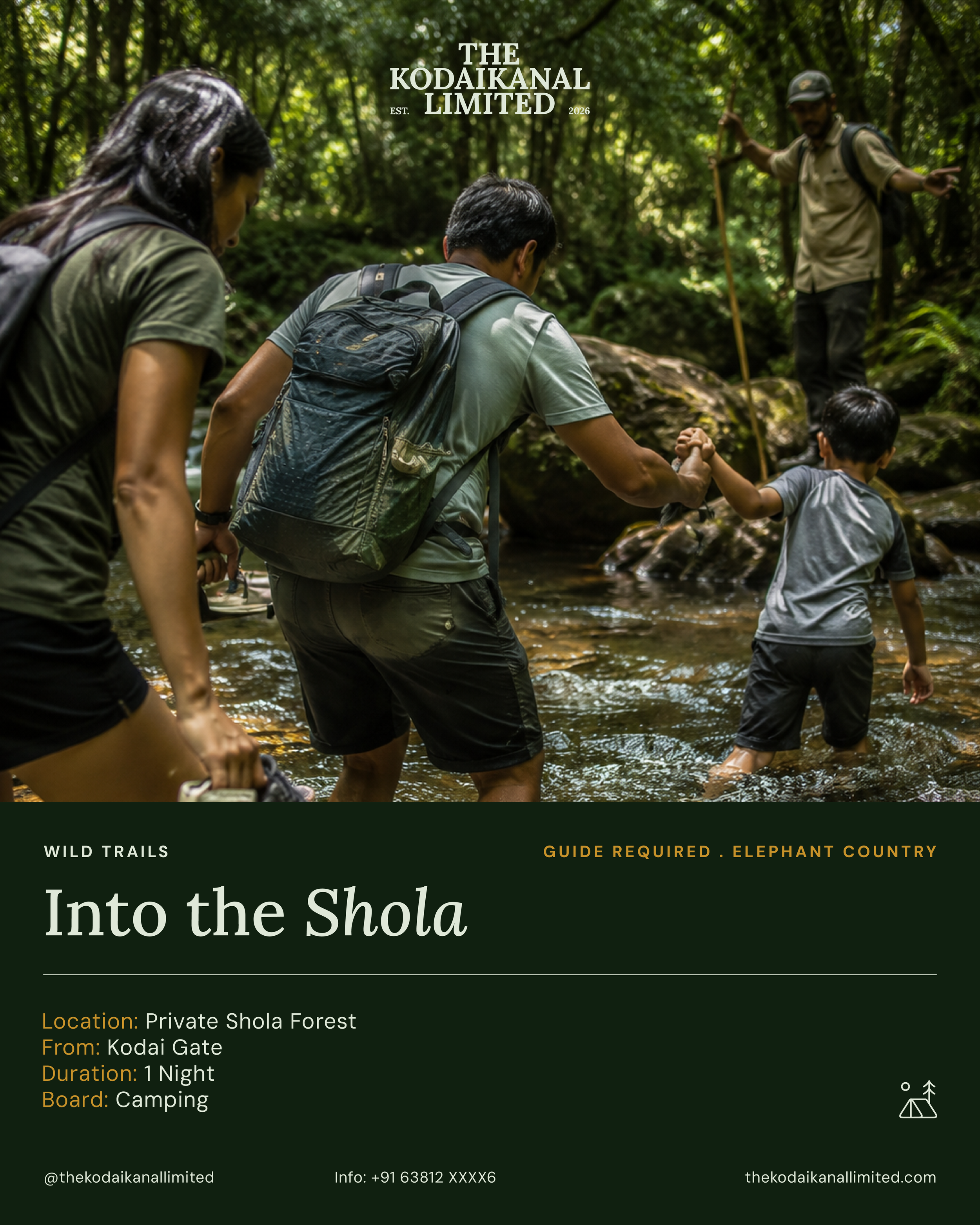
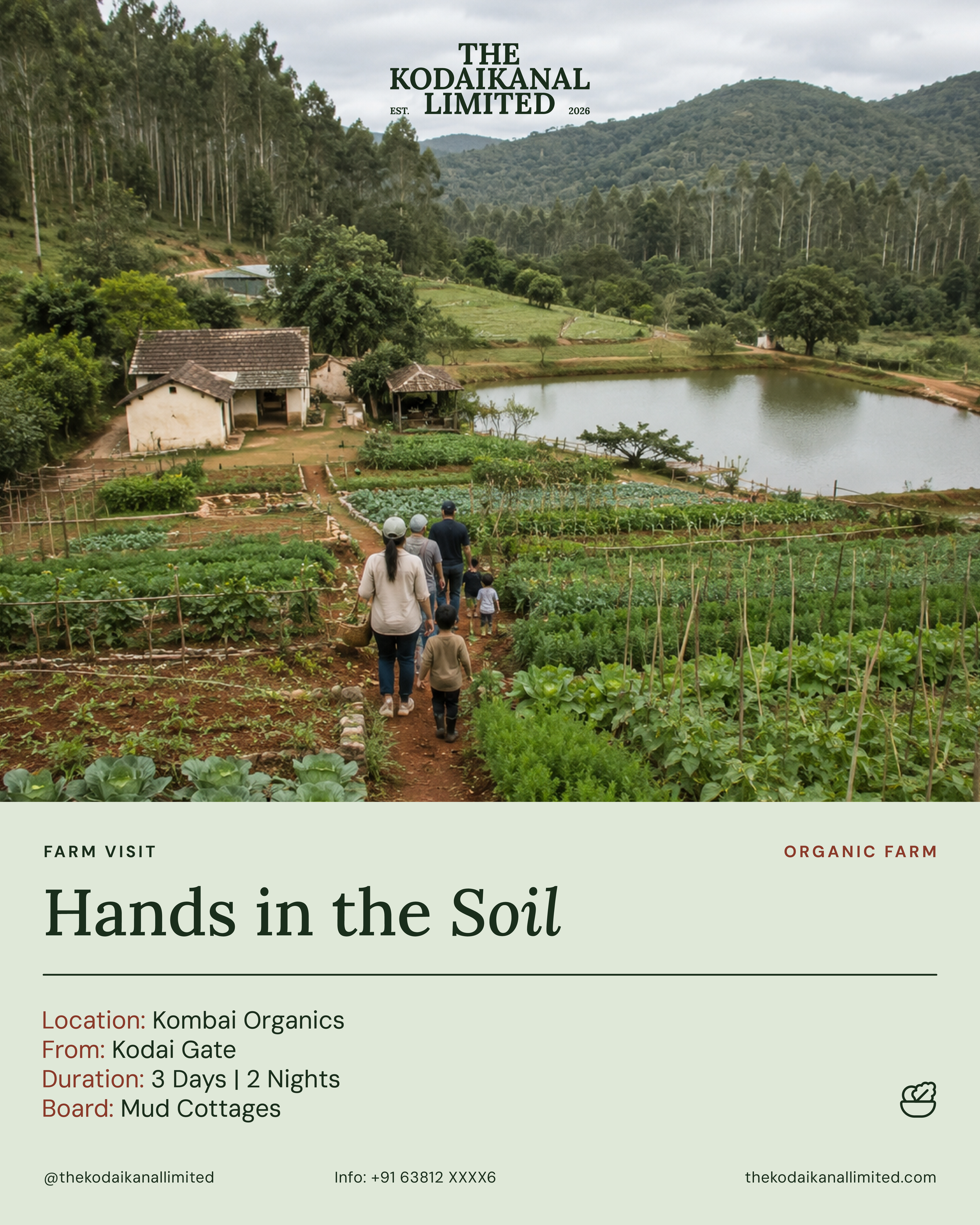
SIGHTSEEING REGISTER: Instagram Tourism · Offbeat Collateral · Estate Access
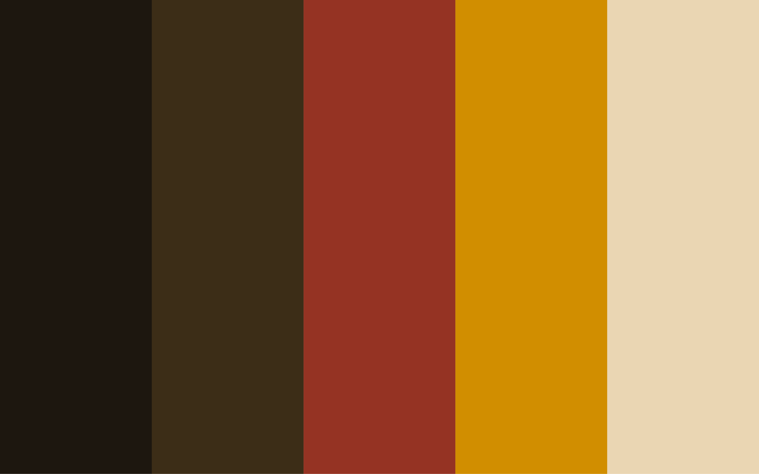
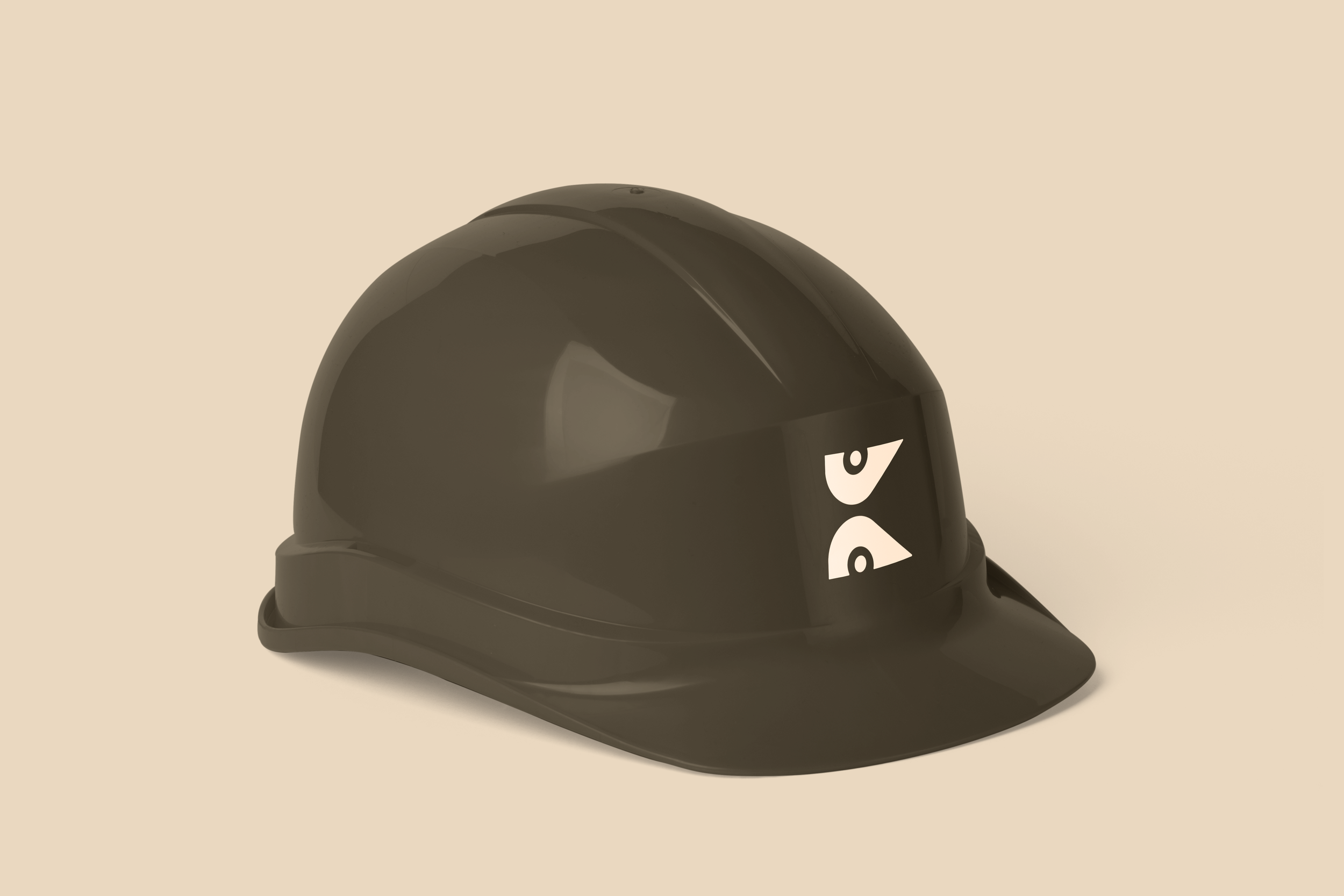
PRIMARY REGISTER: Business cards · Vehicle Livery · Load and Earthmover Collateral
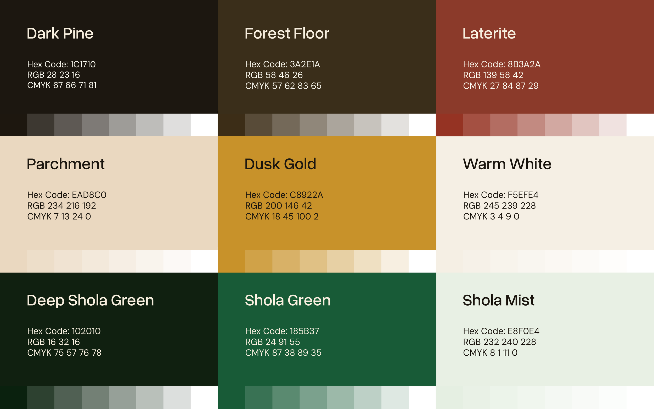
Colour System
Colours sourced
from the hills.
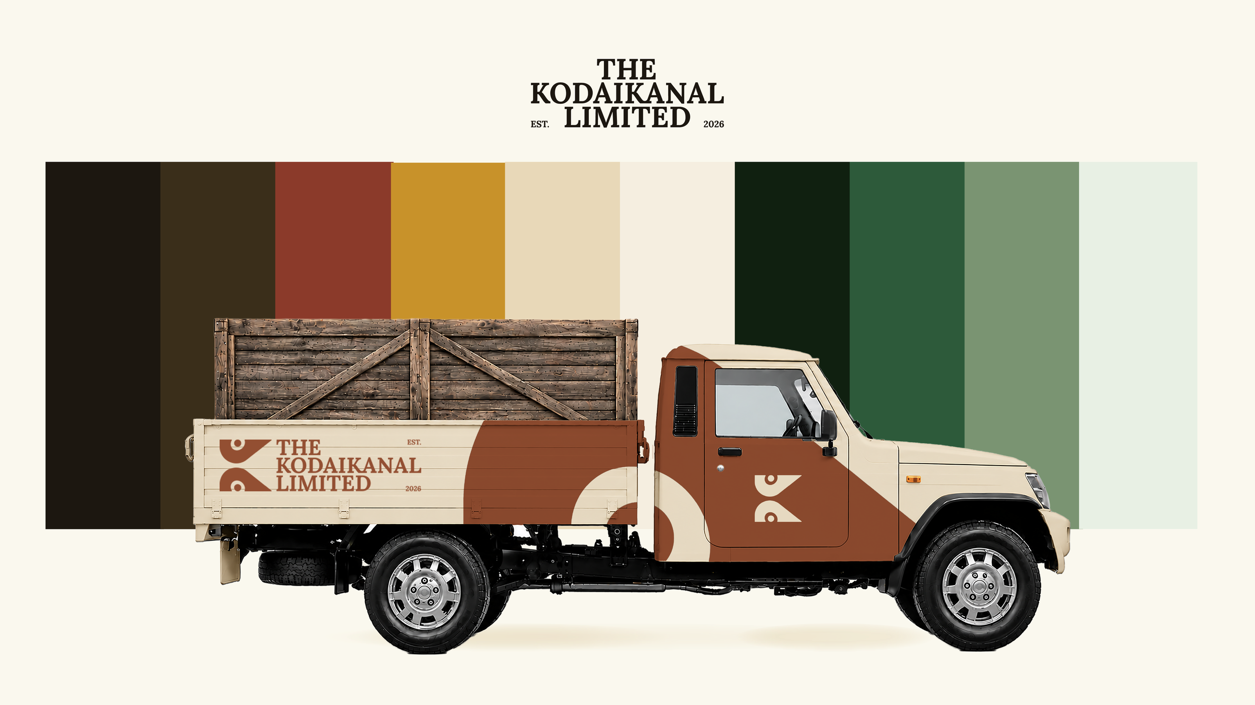
The palette was derived entirely from the Palani Hills landscape. Each colour has a specific geographical source and a specific functional role.
TyPOGRaphy
A system built
for two voices.
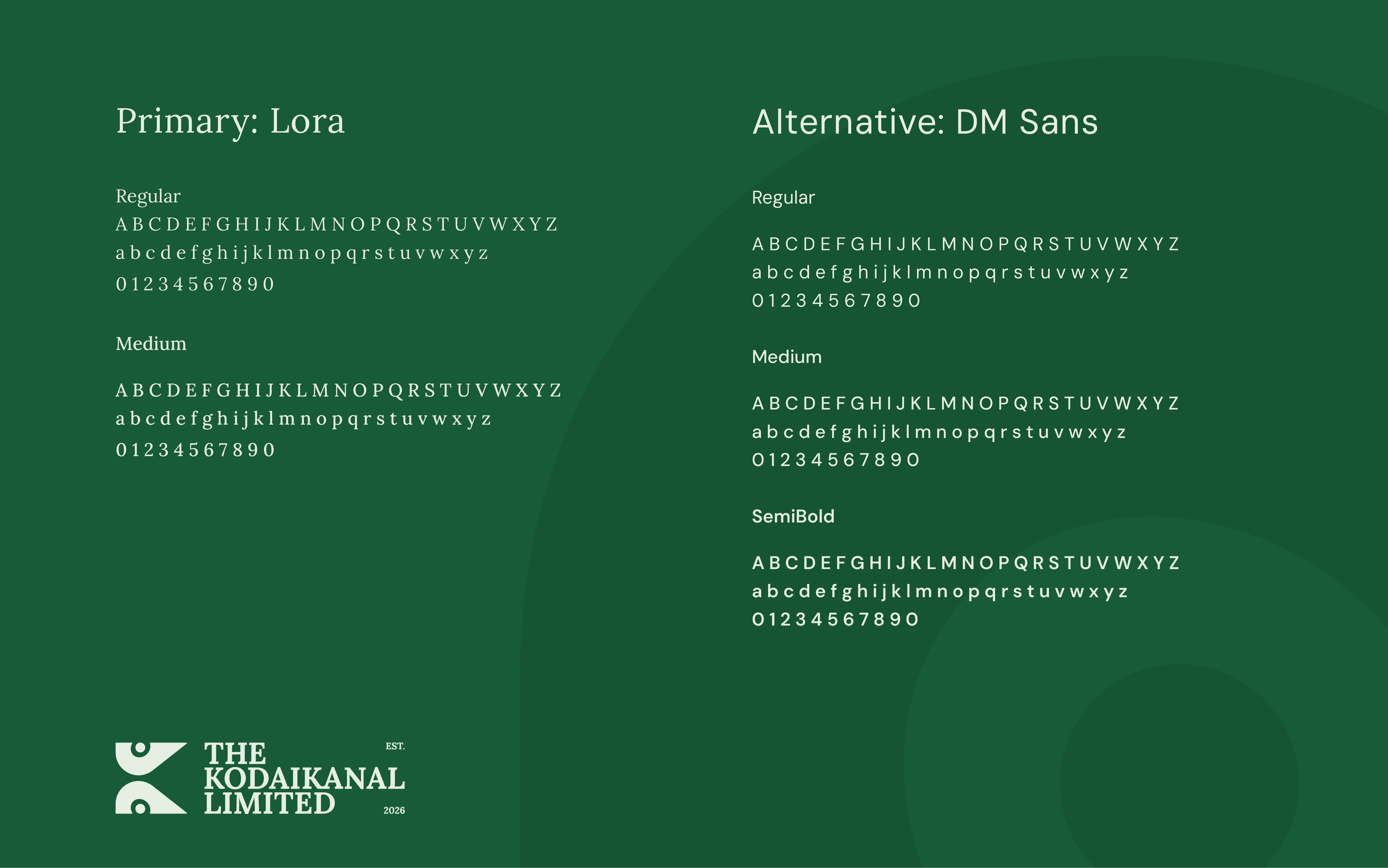
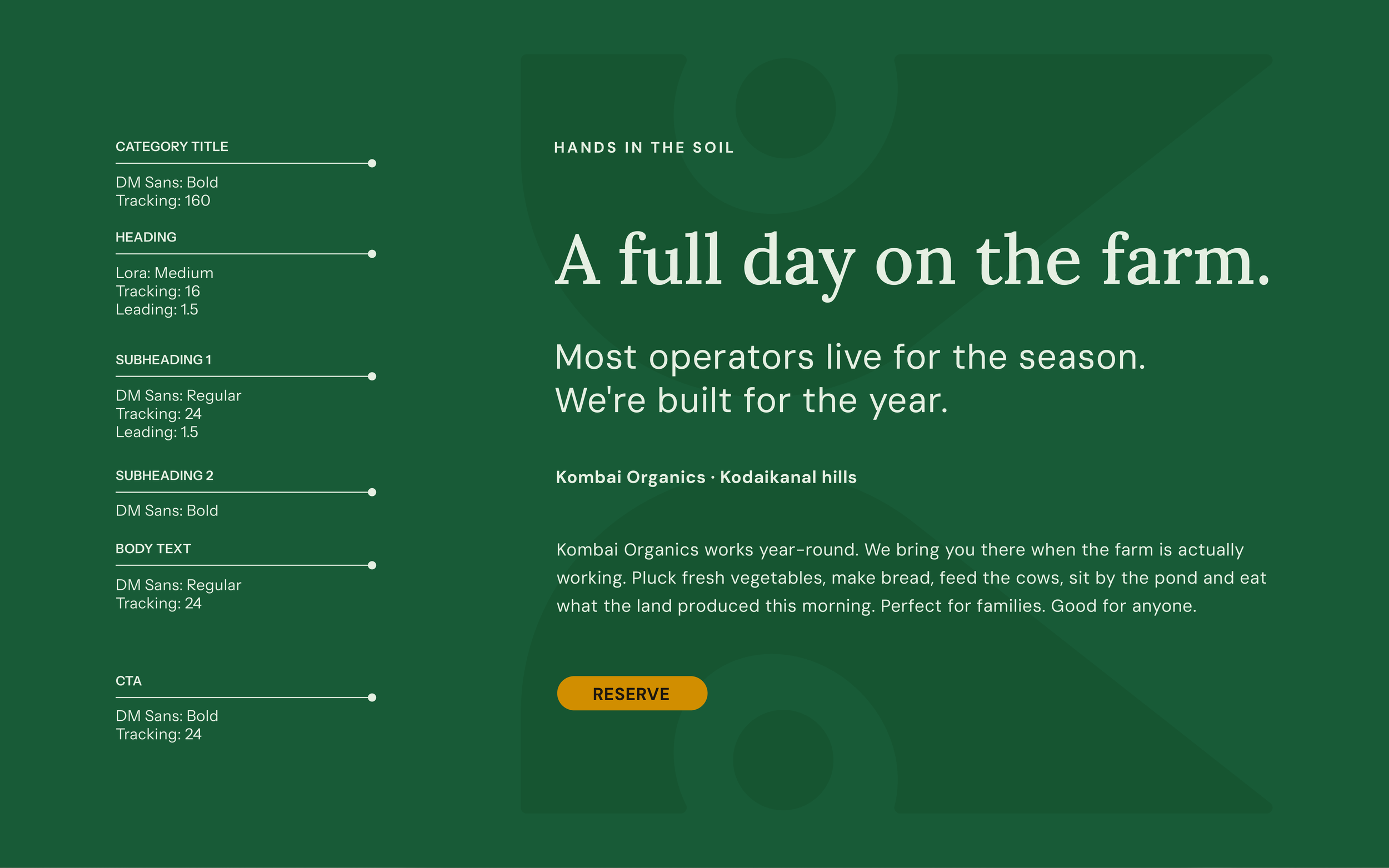
A system built for two voices. Lora and DM Sans form a resolved pairing with editorial authority and working utility. Each typeface has a clear role, and neither compromises the other.