JUST MEAT
Identity Design
Just Meat Protein turns underused cuts of meat into a high-protein powder, using a process licensed from CSIRO. Moving from lab to market, the Queensland startup needed an identity that food manufacturers would trust.

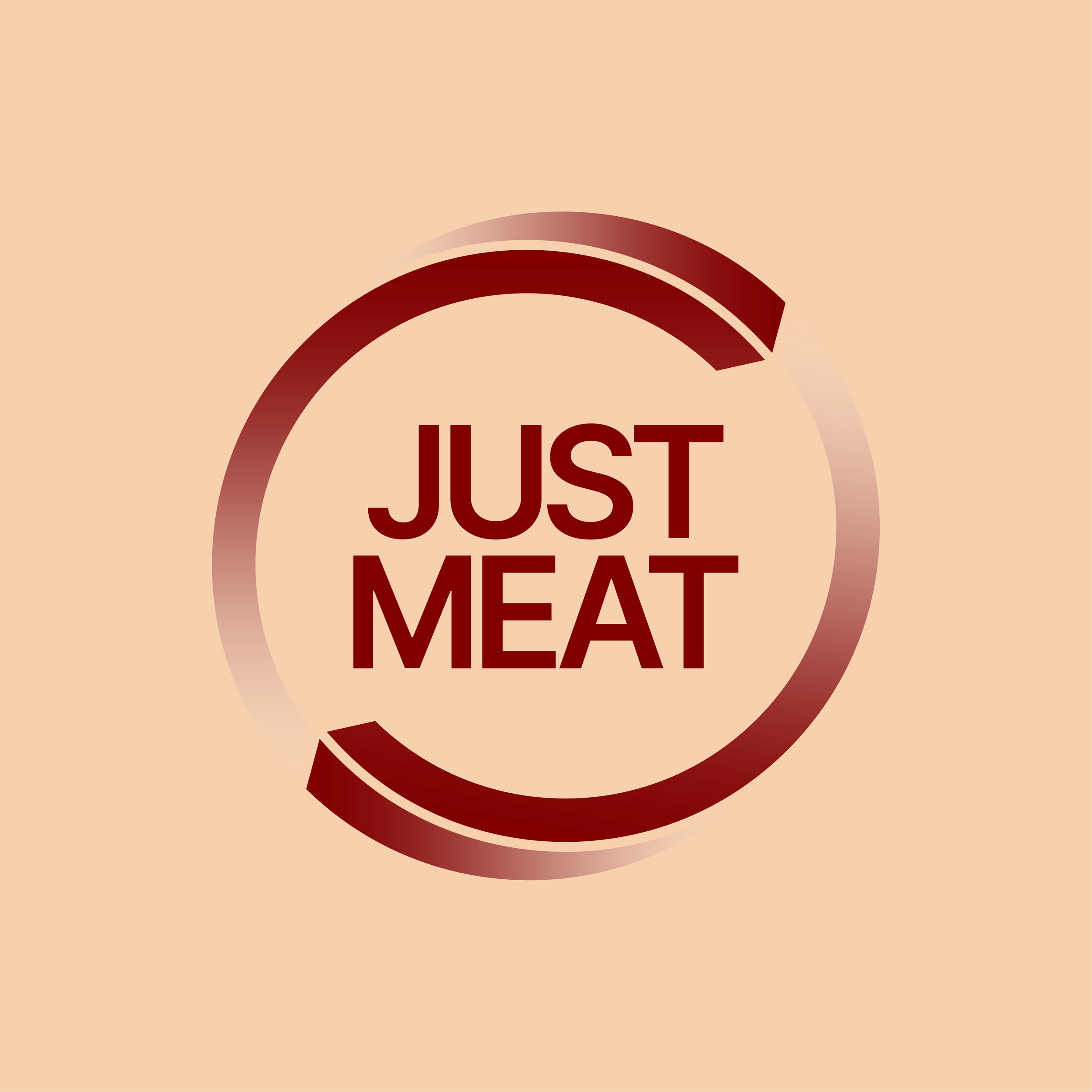

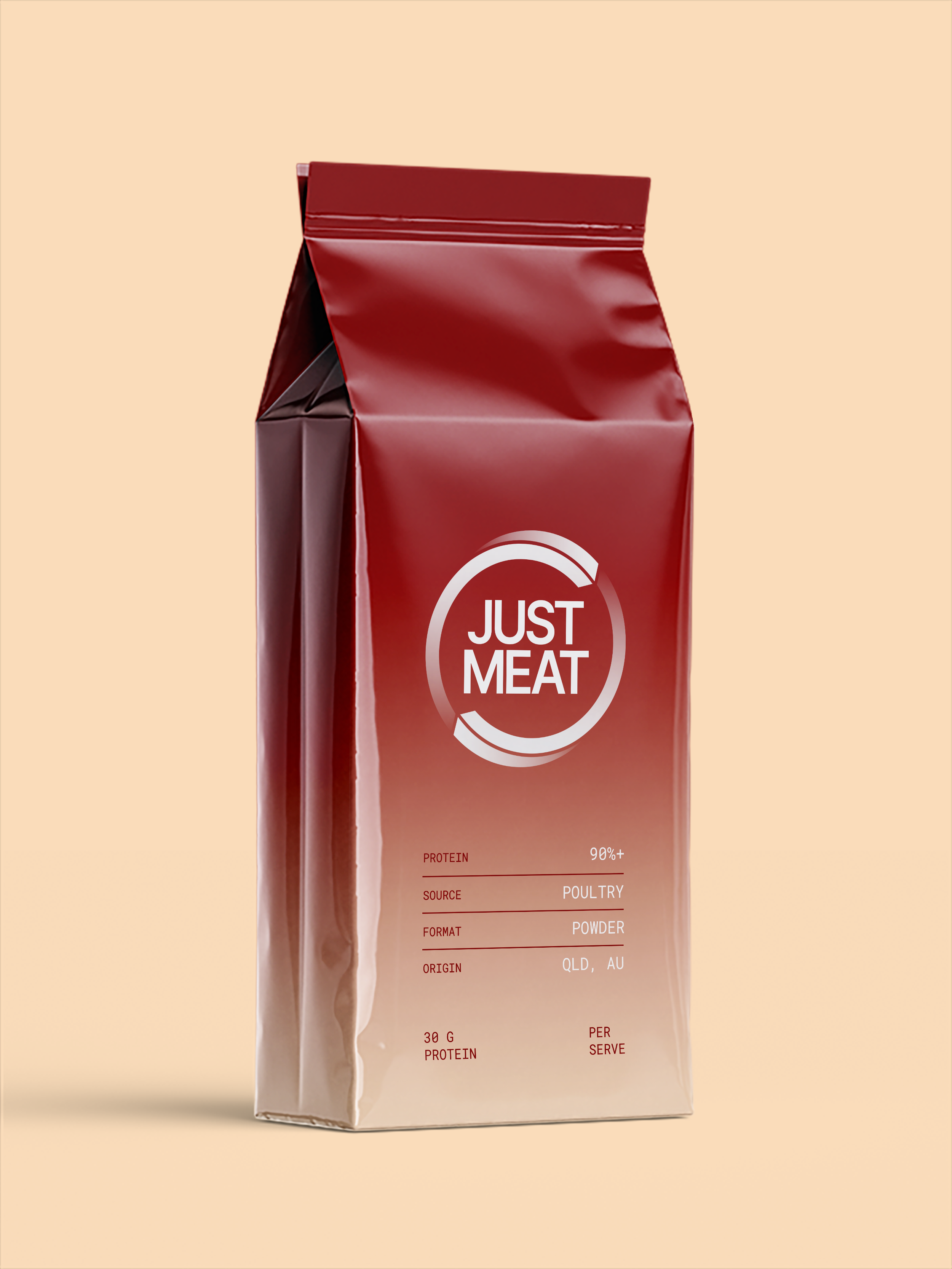
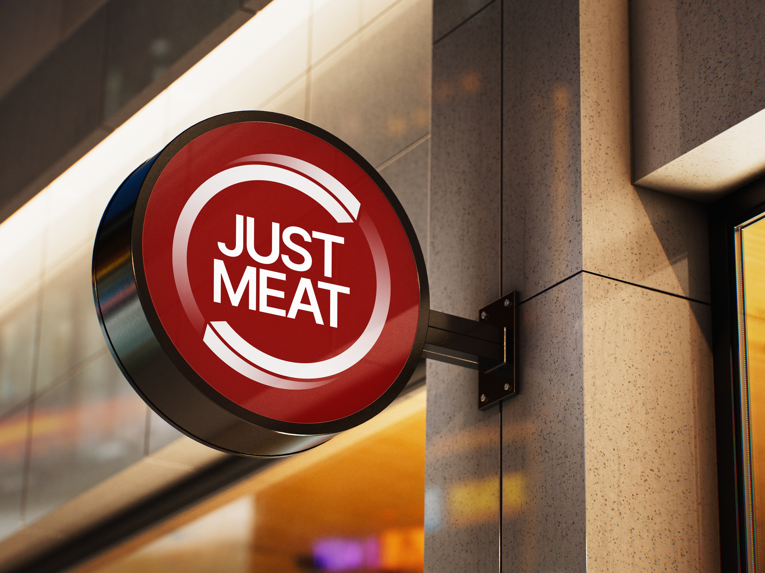
The mark is a circle broken into two arcs, a loop that stands for the idea behind the business: meat that would otherwise go to pet food is brought back into human nutrition. The arcs repeat to form a pattern that works across kraft paper, foil pouches and seals, and the oxblood-and-kraft palette keeps the brand rooted in real food rather than lab-grown or plant-based cues. The system is built to carry the brand both on its own and as an ingredient seal on partners' products. A chocolate protein ball pouch shows how it could sit on a finished product.
TYPOGRAPHY
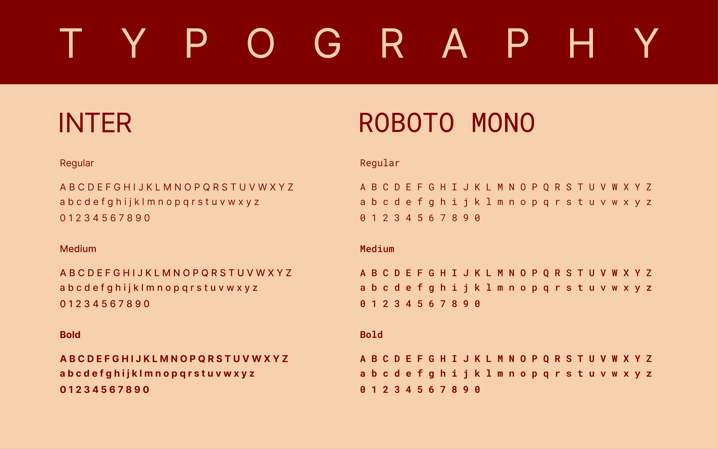
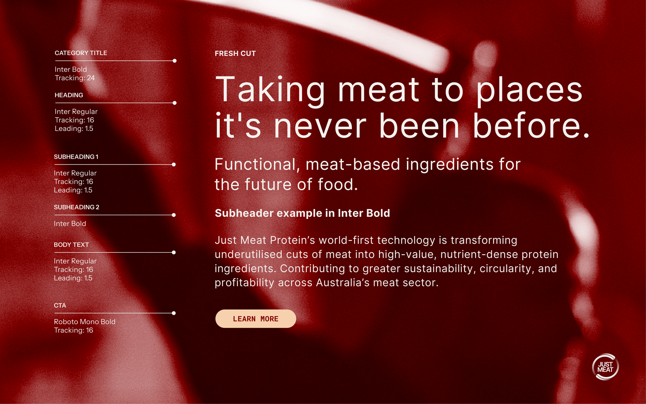
Inter carries the brand. It's a neutral, highly legible sans serif built for screens, and it lets headlines speak plainly, without the bravado of a typical meat brand. Roboto Mono sits alongside it for figures, labels and calls to action. Its fixed-width, data-sheet character brings in the precision of the lab, a quiet reminder that this is a science-led ingredient company. Both are free, open-source typefaces, so the client can use them across web, print and packaging without licensing costs.
COLOUR PALETTE
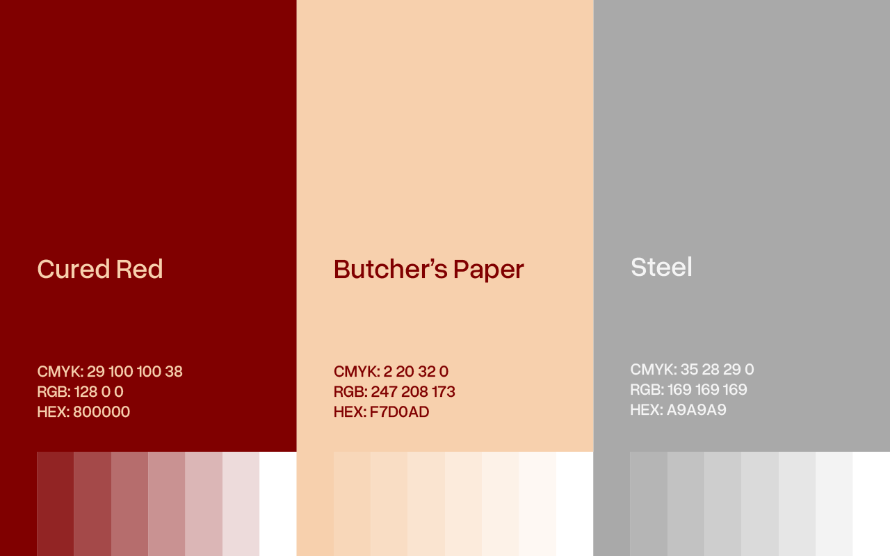
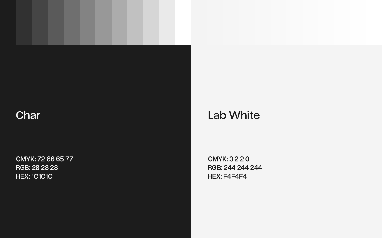
Cured Red leads the palette: a deep, preserved red that signals real meat and appetite without looking raw. Butcher's Paper, a warm peach taken from the kraft wrap of the meat trade, softens the red and keeps the brand approachable. Steel, Char and Lab White do the practical work. They nod to the processing floor and the lab behind the product, and they give spec sheets, data and type a clean, clinical clarity. Each colour comes with a set of tints, so the system stretches from packaging to technical documents without adding new colours.