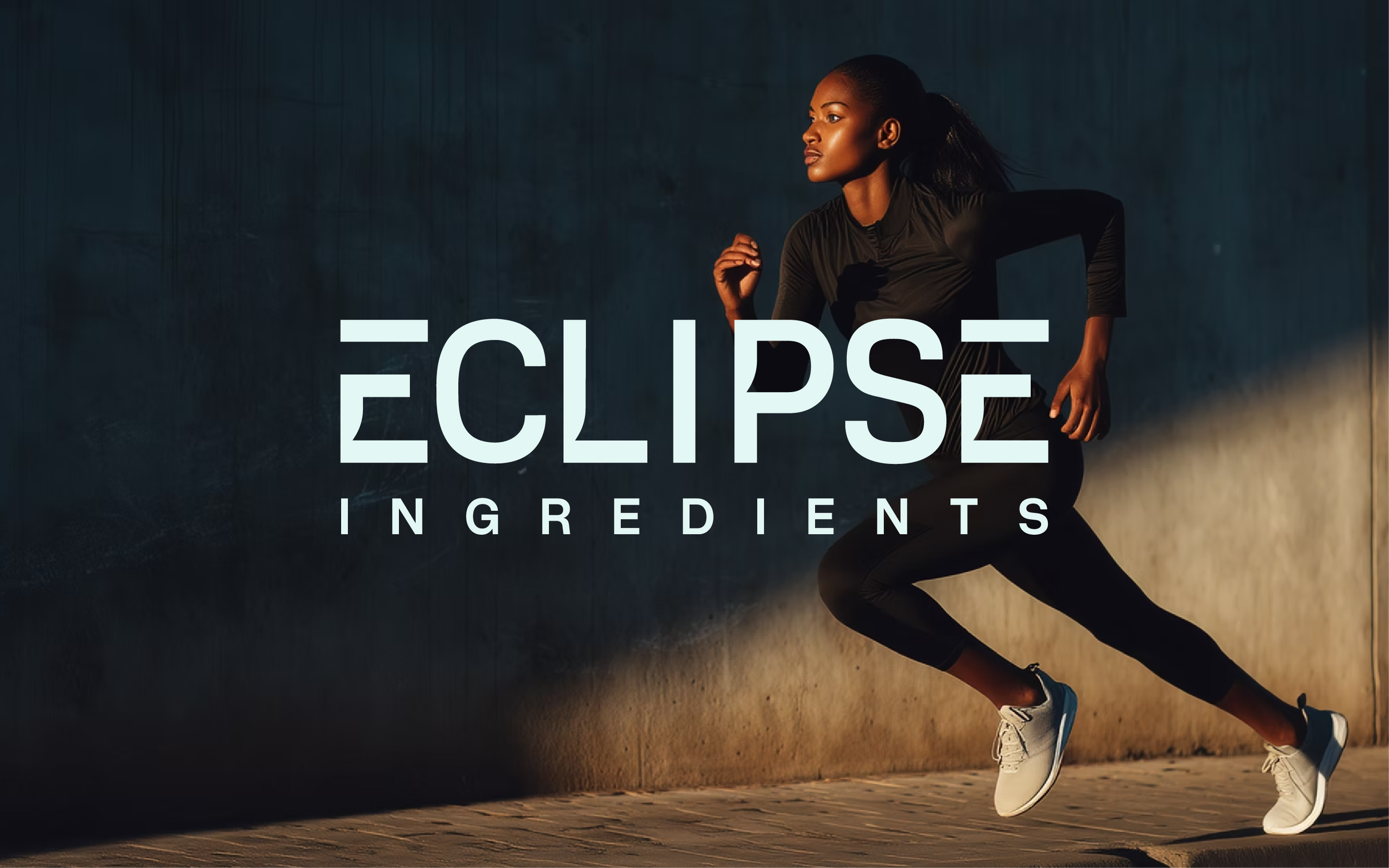
Eclipse is a Brisbane biotech using precision fermentation to make scarce health ingredients accessible. The brand had to feel credible to a science-literate audience while staying warm and approachable for a health-focused one.
Its main goal is infant formula, and it's getting there by first developing applications for premium pet health, cosmetics and sports nutrition brands. Siobhan wanted a distinctive, professional brand that could communicate Eclipse's scientific expertise and its vision for innovation.




The Approach
We started with discovery: mission, values, voice, buyers and personality, narrowed to three logo characteristics (premium, progressive, friendly). That discovery shaped Eclipse's positioning, now the headline on their homepage: "Sustainably creating ingredients that transform health and wellbeing." I then shared three visual directions so we agreed on a route before any concepts.
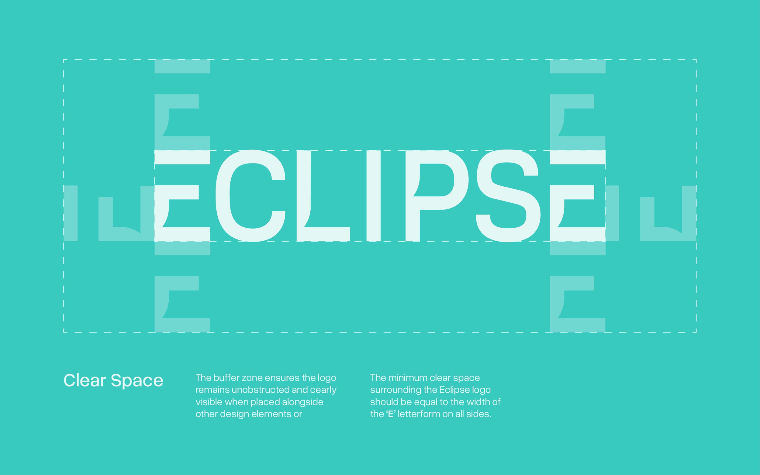
I built the identity around one tension: scientific precision with human impact. The system includes a custom logotype, an abstract "E" logomark, a teal-led palette and clean typography in Overused Grotesk, documented in brand guidelines.

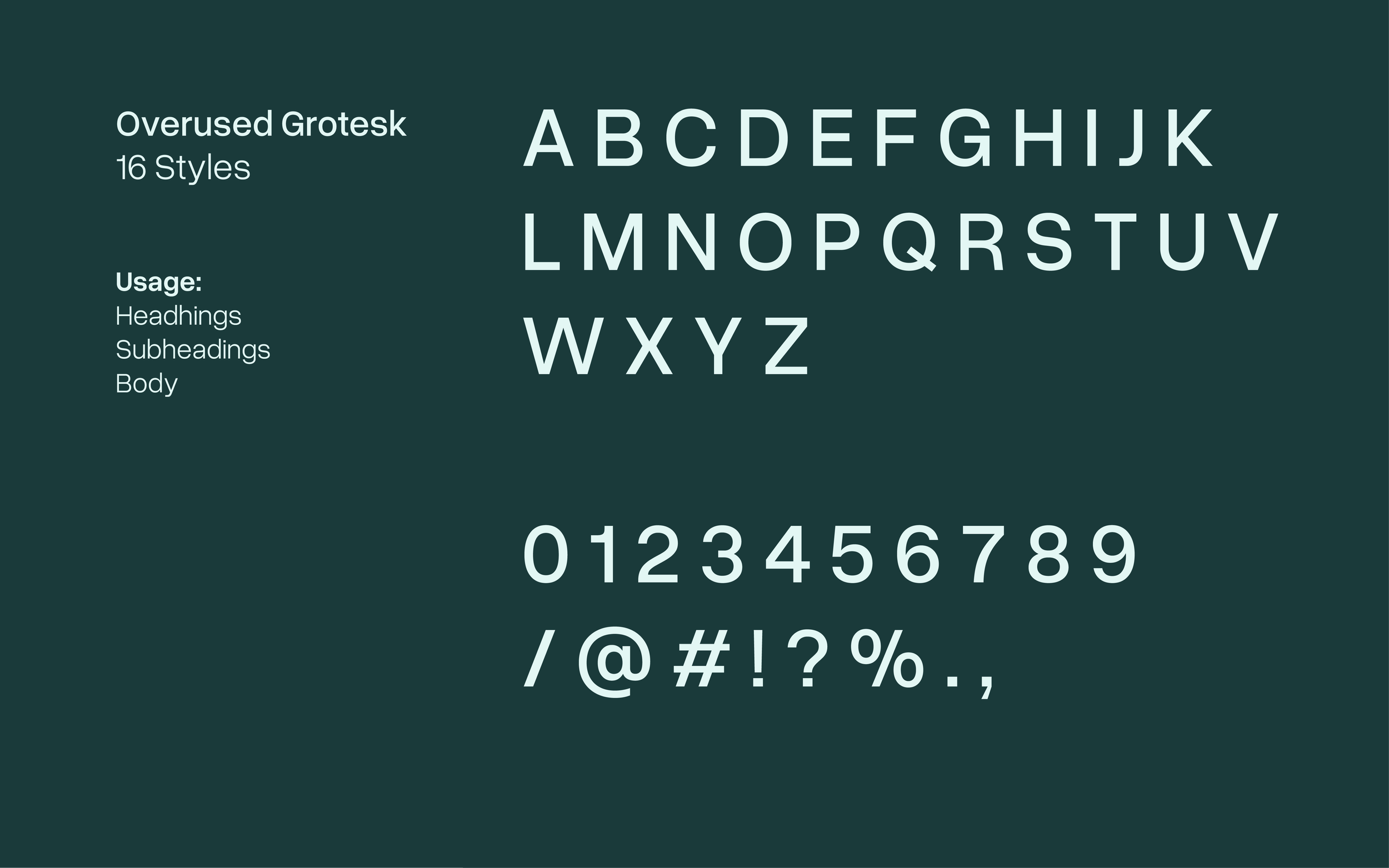
Typography
Overused Grotesk is the primary typeface embodying the company's forward-thinking and science-driven ethos. Its clean lines and refined structure provide a contemporary appeal. With 16 styles available, this typeface ensures clarity and balance.
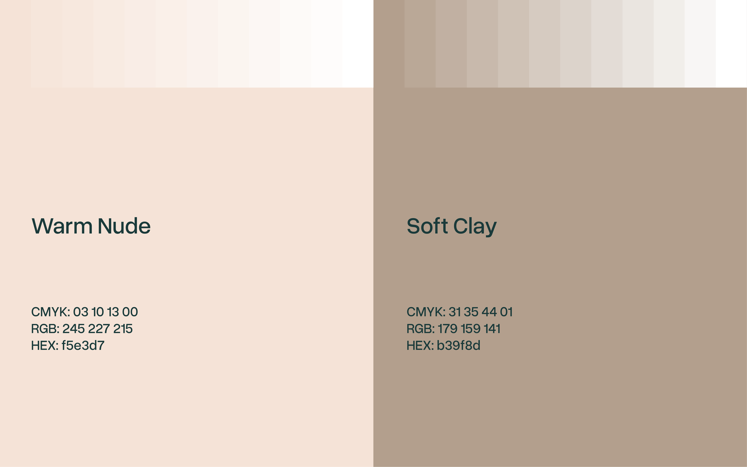
Colour Palette
The Eclipse Ingredients colour palette is designed to reflect the brand’s innovation, trust, and scientific precision while maintaining a premium and health-focused aesthetic.

The Outcome
Eclipse launched publicly with this identity in July 2025, when it emerged from stealth and announced A$7 million in funding. The identity is still in use across Eclipse’s website today.
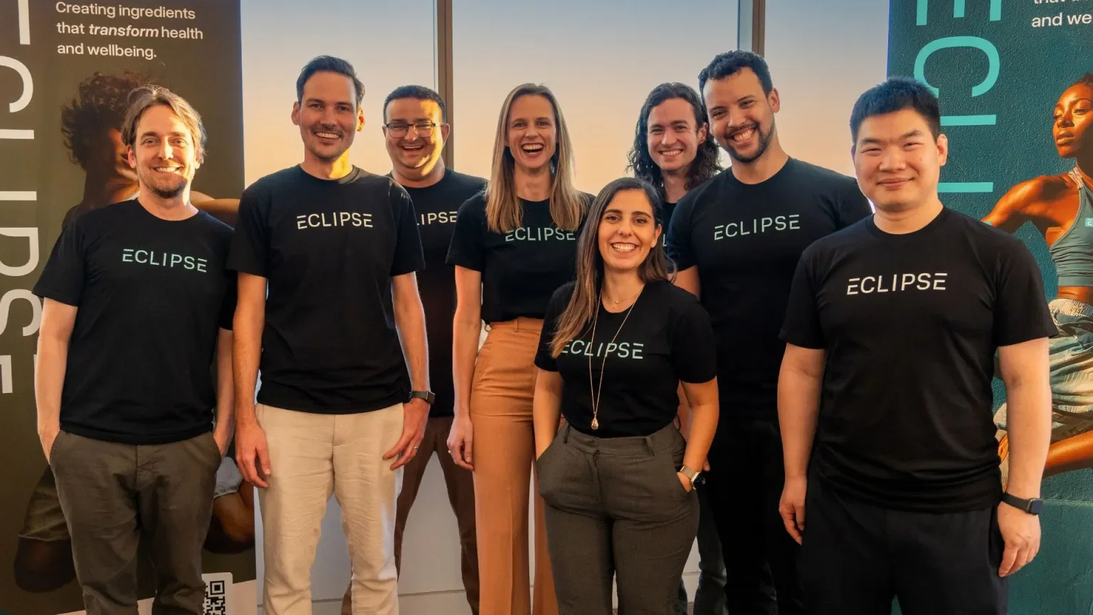
“Working with Aniket on the Eclipse identity was a great experience. We wanted to build a distinctive, professional brand that could communicate our scientific expertise while reflecting our vision for innovation. Aniket was highly professional, responsive, and attentive throughout the process, taking the time to understand our vision and translating it into a thoughtful, cohesive identity. The resulting brand captures this balance well and has given Eclipse a strong, recognisable presence as we continue to grow.”
Siobhan Coster / Founder & CEO of Eclipse Ingredients
Planning a launch?
Thirty minutes. I'll tell you what your brand needs before it goes public.